

There are three typefaces that make up the City of Virginia Beach’s typographic language. They have been chosen for their contrast, as well as their boldness. Their uses are outlined below.
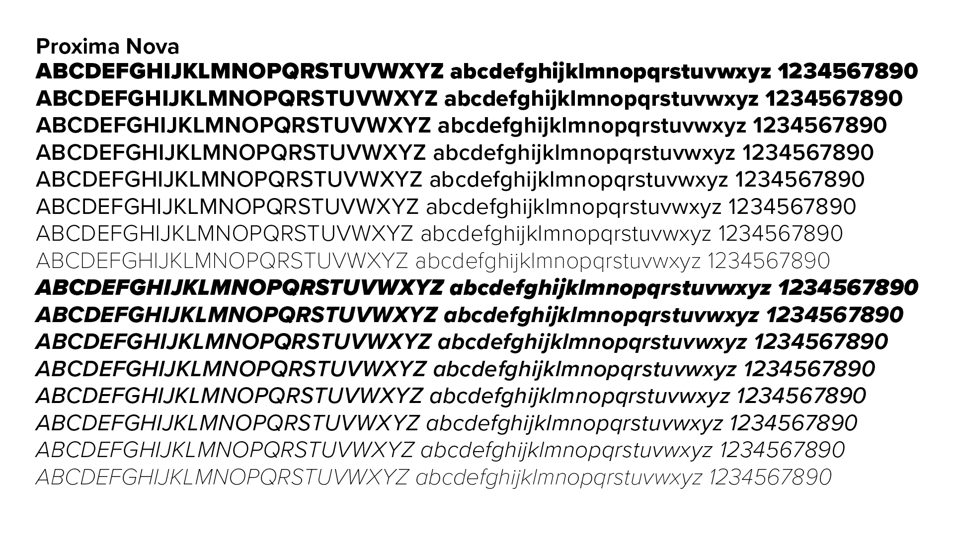
Primary Typeface - Proxima Nova
Proxima Nova is our workhorse font. It is a modern sans-serif that evokes feelings of innovation. It consists of 16 styles and weights and is easily readable in both print and digital media. Ideal use is for headings, subheads, body text, callouts, and captions.
Suggested usages for weights:
- Regular - body copy, text in tables
- Italic - emphasis, highlights
- Bold - emphasis, subheads, hyperlinks
- Extrabold - headings, titles, display, call-to-actions
- Black - headings, titles, display
Secondary Typefaces
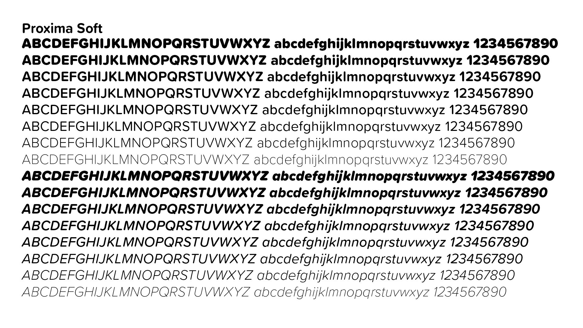
Proxima Soft
Proxima Soft is our display font. Its soft, friendly letter forms draw attention to our community-focused messages and work best when used large. Never use Proxima Soft in body text. Use should be limited to headlines, callouts, call-to-actions, or display text that is no more than one or two lines long.
Suggested usages for weights:
- Italic - emphasis, highlights
- Semibold - emphasis, subheads, hyperlinks
- Bold - headings, titles, call-to-actions
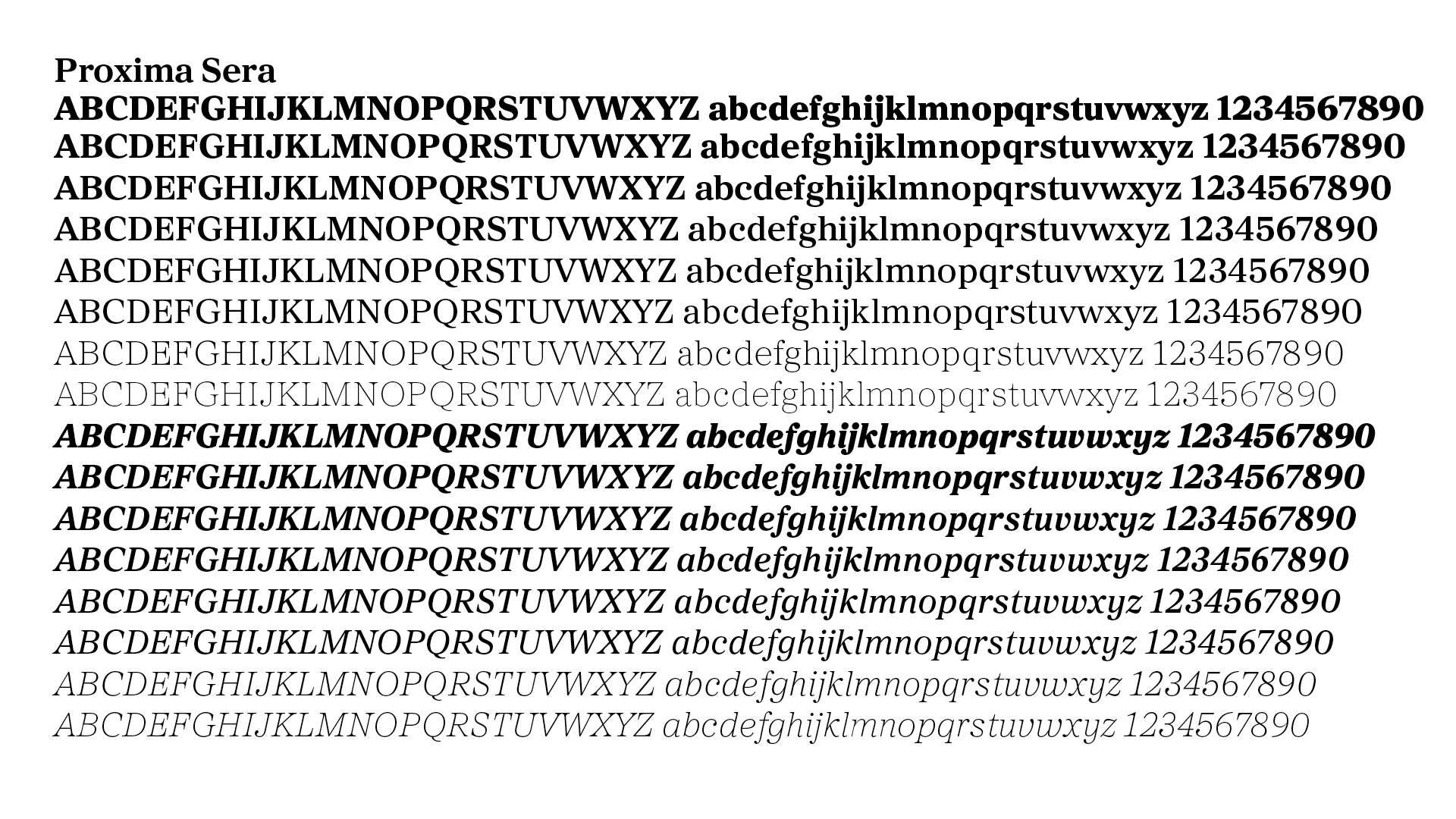
Proxima Sera
Proxima Sera combines characteristics of old style and modern serif typefaces into something new that is clean and highly readable. It is our formal typeface and is ideal for use on communications supporting ceremonies, dedications, and events.
Suggested usages for weights:
- Thin – headings, titles, display
- Regular - body copy
- Italic - emphasis, highlights
- Bold - emphasis, hyperlinks
- Black – headings, titles, display
Don't have Proxima Nova?
In instances where the Proxima font family is unavailable, the Arial and Calibri font families are the only acceptable substitutes.