Inspired by the City seal, our colors represent a fresh, rejuvenated identity for the City of Virginia Beach. The palette reflects the vibrant energy of our facilities, workspaces, local surroundings and cultural experiences.
Gold and orange represent the sunrise over the Atlantic Ocean - an opportunity to start each day refreshed and renewed. Blue represents the miles of clean, healthy waterways that connect to inspire us. Green represents our abundant natural resources and agricultural areas, as well as our vast recreational offerings.
Color Builds

#003764
C100, M78, Y36, K28
R12, G60, B97

#199ad6
C75, M25, Y0, K0
R28, G154, B214

#0c8742
C87, M22, Y100, K10
R12, G135, B66

#ffb81d
C0, M32, Y94, K0
R253, G181, B40

#f16122
C0, M77, Y100, K0
R241, G97, B34
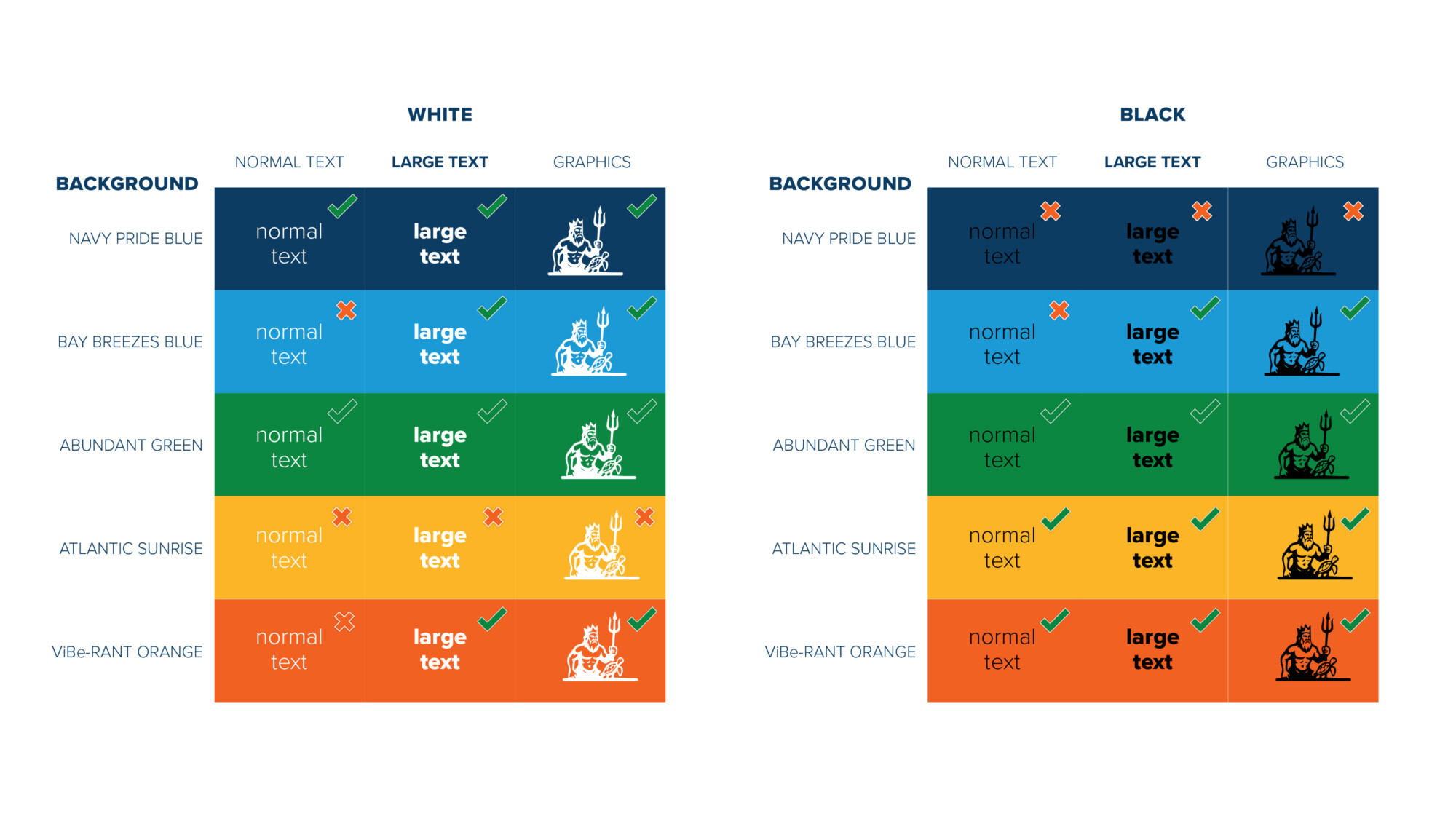
Using Colors for Accessibility
Color Contrast
- Choose a text color that provides a high level of contrast against the background.
- The standard for web accessibility is a ratio between the two colors of 4.5:1 (or 3:1 for large text).
- Avoid light text on a light background or dark text on dark background.
Color for Meaning
- Avoid using color as the only indicator of meaning or information when possible.
- Use an additional element to convey information, such as shape and weight differences.
- Colors used to convey information on graphs, charts, maps or other infographics should have a contrast ratio of 3:1 (or use a unique pattern) when used next to each other
Brand Color Contrast Guide
The following brand color guide is based on RGB hexadecimal (hex) color values at 100% tint and opacity. If a tint or screen is utilized, contrast ratios will change and should be checked with a color accessibility checker.
“Normal” text refers to text that is 14 point and below. “Large” text refers to text larger than 14 point. "Graphics' refer to bullet points, logos, or any other purposeful visual information.
Navy Pride Blue
- White text (normal and large) and graphics on Navy Pride Blue meet accessibility standards.
- Black text (normal and large) and graphics on Navy Pride Blue do not meet accessibility standards.
Bay Breezes Blue
- White large text and graphics on Bay Breezes Blue meet accessibility standards.
- White normal text on Bay Breezes Blue does not meet accessibility standards.
- Black large text and graphics on Bay Breezes Blue meet accessibility standards.
- Black normal text on Bay Breezes Blue does not meet accessibility standards.
Abundant Green
- White text (normal and large) and graphics on Abundant Green meet accessibility standards.
- Black text (normal and large) and graphics on Abundant Green meet accessibility standards.
Atlantic Sunrise
- Black text (normal and large) and graphics on Atlantic Sunrise meet accessibility standards.
- White text (normal and large) and graphics on Atlantic Sunrise do not meet accessibility standards.
ViBe-rant Orange
- White large text and graphics on ViBe-rant Orange meet accessibility standards.
- White normal text on ViBe-rant Orange does not meet accessibility standards.
- Black text (normal and large) and graphics on ViBe-rant Orange meet accessibility standards.