

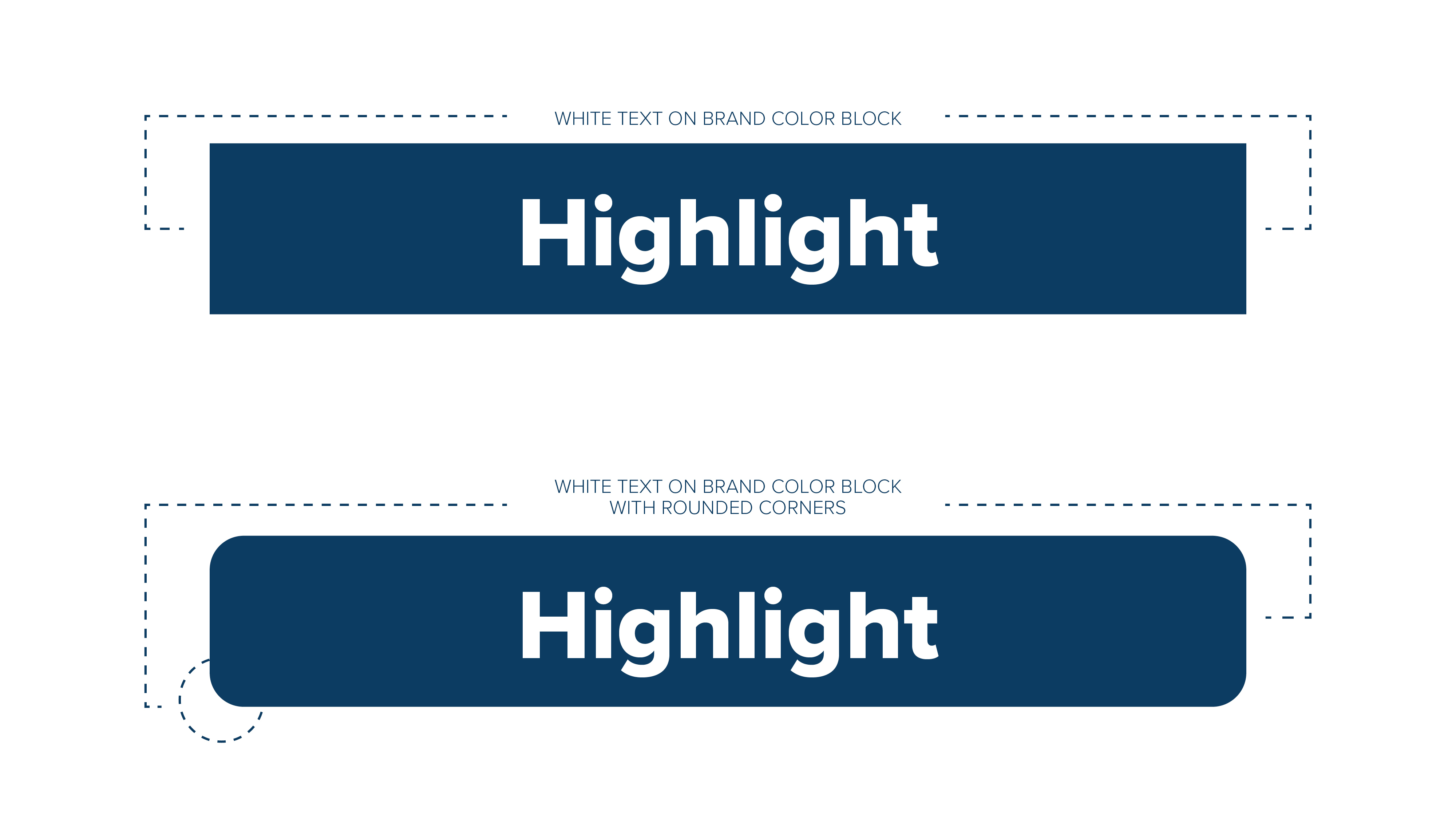
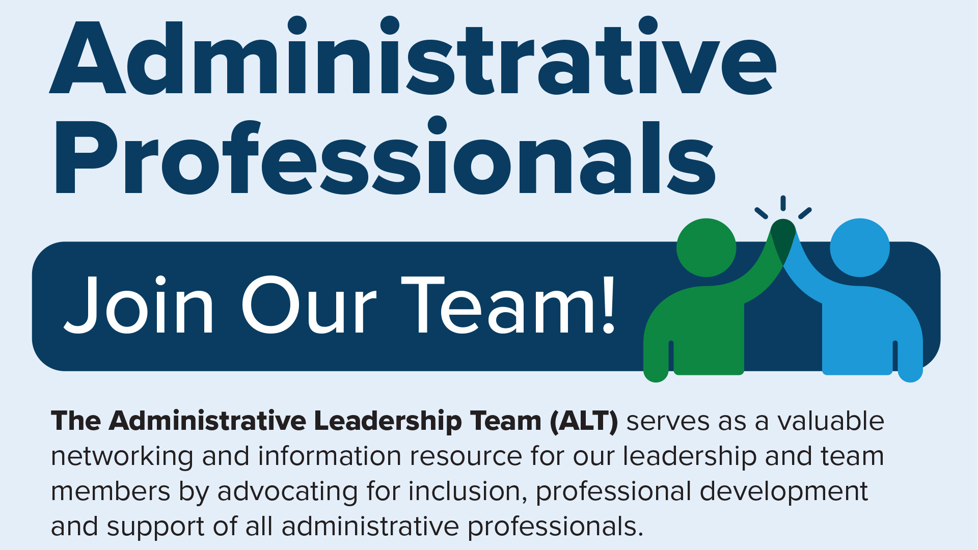
Highlights
The highlight indicates the focused, important parts of our messaging. Use to call out certain pieces of information, set apart copy from a similarly colored background, or to add movement to a layout.
Highlights should be in a brand color, black or white.
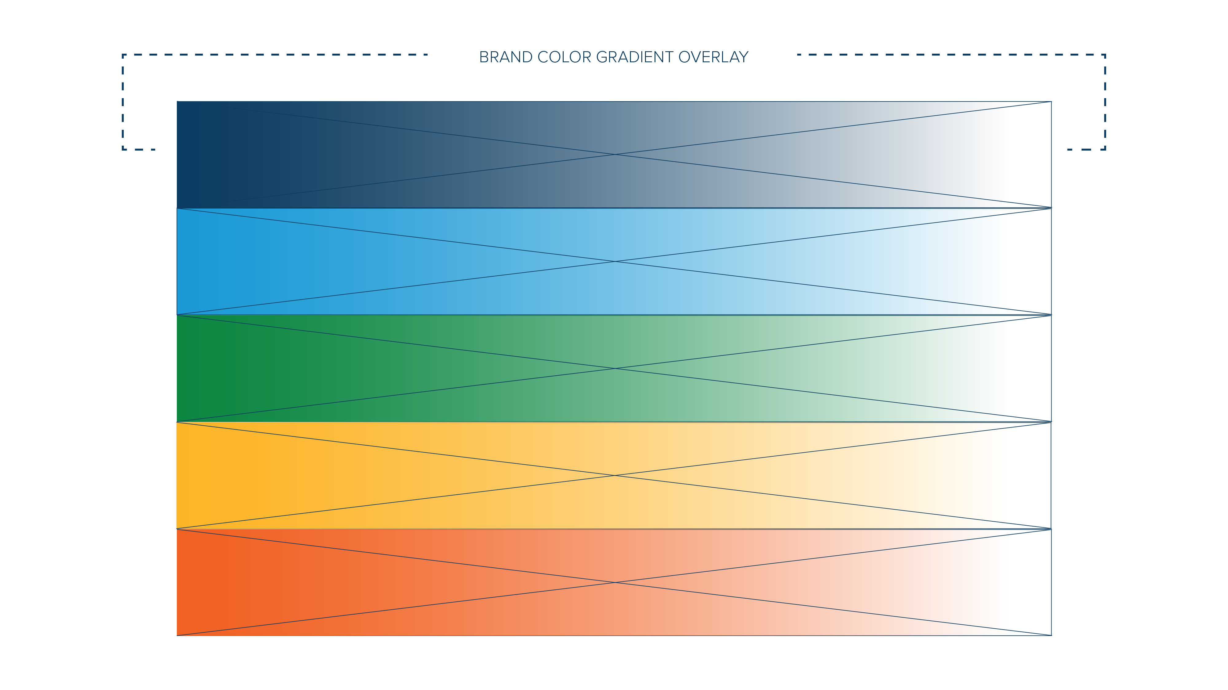
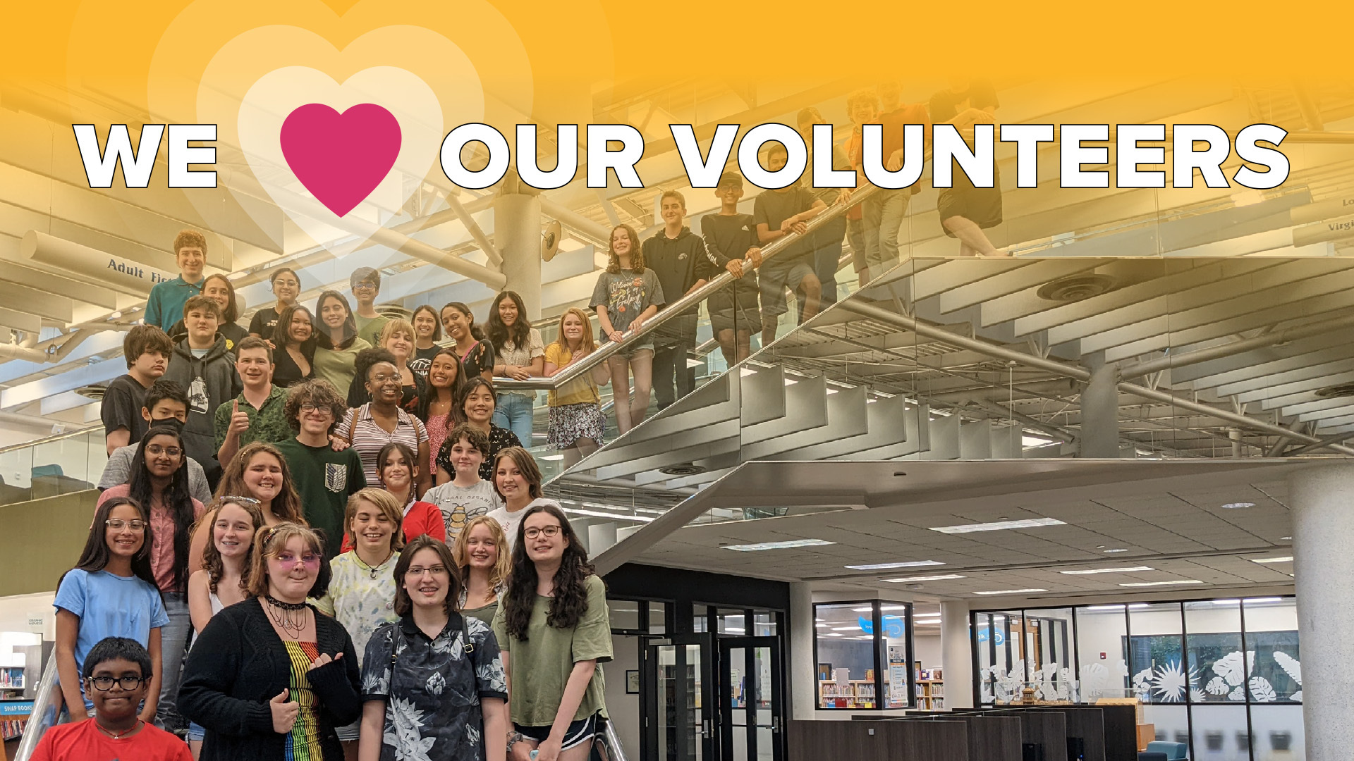
Gradient Textures
Gradient textures represent how resourceful and progressive we are - showing ideas blending together in one place. Use as an overlay on backgrounds and layered on top of images to create dynamic and engaging visuals that add depth to design layouts.
Iconography
Icons can enrich content and represent complex or detailed concepts in a way that helps audiences process information. With their illustrative quality, icons offer contrast to blocks of text and photo-driven content.
Icons should be in a brand color, black, or white.
![]()
![]()